Tuesday 22 April 2014

Key Hardware and Software Used

iMacs were used in order to construct all elements of the products in our portfolio. They were useful due to all the software installed on them, such as:

We used Final Cut Express for creating our music video. Tools such as the overlay and transitions were incredibly useful and allowed us to create a more professional effect over our piece, as well as allowing creative decisions to be carried out.


Photoshop allowed us to create both our digipack and magazine advert. Although finding Photoshop quite hard to comprehend at the beginning, I soon picked up the basics, and YouTube tutorials definitely helped. Previous knowledge on Final Cut also proved useful, with the tools and their symbols being fairly similar.
Another obviously crucial piece of equipment was the Canon HD video cameras used to shoot our music video, as well as the mock music video. These were great as although they provided high quality footage, they were still very small meaning they were easily maneuverable and allowed us to use them when in town.

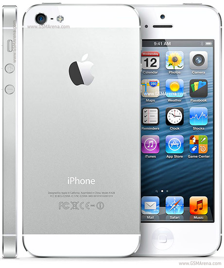
iPhones were also used in production, we used them to take the pictures for our digipack and magazine advert. This was good as again, they are small, however the camera quality is still quite high.

Tuesday 14 January 2014

Evaluation

Question 1:
                       In what ways does your media product use, develop or challenge forms and conventions of real media products?


Question 2:
                            What technologies have been used in the creation of your media portfolio?


Question 3:
                           What have you learned from your audience feedback?
(See annotations)

Question 4:
                   How effective is the combination of your main product and ancillary texts?


Tuesday 24 December 2013

Feedback: Interpretation of Feedback

From our feedback, what stood out the most was the difficulty audience members had following our narrative. Although it wasn't said by all audience members, and some actually picked this out as one of their favourite parts of the video.

It was encouraging to read very few negative comments of the technical elements involved in the production and post-production of our music video. This was something which we worked hard to improve on from AS level, so the comments suggest that we have in fact improved.

Sunday 22 December 2013

Feedback: Questionnaire


This will be distributed to 2 different media classes, as well as some extra friends and family. In total, we are hoping for around 40 responses.

Saturday 21 December 2013

Magazine Cover


_________________________________________________________________________________

We kept the fonts used in the magazine cover the same as the font used for the artists name in the album.
We followed what most other magazine adverts have done, by using the album cover as the central focus, with just a small amount of text around it. We put a red line on the edge of the album as it made it clear what to look for when looking to buy the album; using the colour picker tool to make the red the same colour as the one in the album. 

We inserted the stars as a rating system, which is commonly used in magazine adverts, and it encourages people to buy the album. The quotes are in a different font as it differentiates them as different media organizations, and makes the praise stand out.

Friday 20 December 2013

Shots for Digipack Inlay


_________________________________________________________________________________

These are the shots which we would include in the inlay of the album cover, taken during filming.

We cropped them so that they were square, to fit into the album, and then changed the colours. In the first picture we lightened it, then increased the brightness and contrast. We also reduced the hue, as where we had increased the others, the colour had started to go quite orange. In the second image we done a similar thing.

Overall, I like the effect on these two images. They are in a natural setting, but the brightness added makes it seem less realistic and less gloomy. It also contrasts to the black and white of the album cover.